Thursday, June 16, 2011

Digital Studio Techniques Final Tutorial

Today you all get a 2 for 1! Retro AND abstract! (and a little grungy)


A bit last minute but what the hell. I think it was worth the 8 hours of work.

Oh, am I proud of this one.


I'll do a reflection on the class later...I've been sitting in this chair too long. But it was a good ride.

Wednesday, June 15, 2011

Original Poster Proj 4

I experimented with various geometric shapes, even at first using the above shape tiled straight across the page...which turned out to be too busy too murky too just...ew. I fell back on this design, making the shape in illustrator then moving it over to photoshop. Let me tell you once you start dealing with 18+ layers with blending modes, it only takes 1-2% to throw EVERYTHING out of wack and lead to 20 minutes of additional work.

Tuesday, June 14, 2011

Recreation of Retro Poster

Duplication of the original artwork was rather difficult since each layer and color built off of each other.  Using Illustrator, I built the general shape of the shards, along with the general gradients before importing them into photoshop, then adding adjustment layers, along with highlights. There are also Cyan, megenta, yellow and green layers beneath everything as well as a base 50/50 grey.

My take on it will uploaded in a few hours, once I you know, complete it.

As for the final, I'm currently experimenting with various techniques to produce a concise work.

Saturday, June 4, 2011

Aging in Photoshop? Possibly.

I found a very interesting image of a half old/young pres obama, been looking into the techniques required to make it. I haven't quite decided if I want to pursue it or not but not ruling it out. I'm going to do some more lurking to see what else I can find that peeks my interest...

Friday, June 3, 2011

Bottle Bottle Making

Woot! Finally got this project finished. It was a lot more time consuming than expected. What you see is maybe 8hr work today? But I like the final result a lot so I have no complants.

Not so much of the time was spent to get the image together but more of the tweeking of the various layers to make it look exactly the way I liked. The first steps, as recommended by prof Babcock, were taken in illustrator to get the bottle shape right and nice and flowing, then it was over to photoshop! Trying to preserve a constant shading across different layers, shapes was a pain. The main bottle shading was much easier than expected to be honest, just various shapes filled with white and red, then blurred to oblivion, simple, but it gave the bottle the shading that I was looking for. To give the strong lighting effects I did a lot of gradient overlays though the different shapes, which nailing down the right shapes was more difficult than expected. I most definitely went to the store and got some cheap wine (legally! for the first time) for reference, which also helped quite a bit.

Thursday, June 2, 2011

Bottle Rendering/ Making

As stated in my previous post, my next project is to produce a realistic looking bottle. Though my research I discovered that there are two main ways to go about it, to generalize it a lot the two different methods are photoshop and illustrator. Below are my 2 takes on the techniques, and it was more of a practice than a full blown work of art, so they will be lacking in some detail, but the gist of the techniques are there.
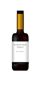

For the photoshop take on the wine bottles, it includes a lot of gradients to get the shading down. First you start off by drawing half the bottle and mirroring it, as doing anything else is likely not to replicate it perfectly and it is quite noticeable(trust me) To get the general lighting you make some red and white rounded rectangles and then with a liberal use of gaussian blur it makes some very nice soft lighting. For the labels are mainly made using gradient overlays, which required a lot of fine touching to make it look fairly realistic. A lot of tweeking followed to produce the results that you see.
 

This was my take on making an actual 3d rendering of a bottle. As you can see above you start out with a path and use the 3d revolve to make the flushed out shape. I was less than impressed with this technique, not only was it touchy as hell, the results were not as I liked, I lacked control to fine tune the shading and it just looks...meh. Also it was seriously taxing on my computer system which just added to the frustrations. the only advantage that I honestly saw was the fact that you can make a open topped bottle and have multiple bottles at various angles with fairly limited effort.

I decided that I shall make a fully flushed out photoshop version of the bottle, as the control that you have, along with the final product look awesome and high class.