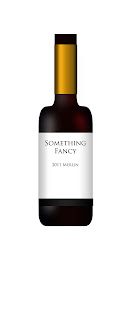
For the photoshop take on the wine bottles, it includes a lot of gradients to get the shading down. First you start off by drawing half the bottle and mirroring it, as doing anything else is likely not to replicate it perfectly and it is quite noticeable(trust me) To get the general lighting you make some red and white rounded rectangles and then with a liberal use of gaussian blur it makes some very nice soft lighting. For the labels are mainly made using gradient overlays, which required a lot of fine touching to make it look fairly realistic. A lot of tweeking followed to produce the results that you see.
This was my take on making an actual 3d rendering of a bottle. As you can see above you start out with a path and use the 3d revolve to make the flushed out shape. I was less than impressed with this technique, not only was it touchy as hell, the results were not as I liked, I lacked control to fine tune the shading and it just looks...meh. Also it was seriously taxing on my computer system which just added to the frustrations. the only advantage that I honestly saw was the fact that you can make a open topped bottle and have multiple bottles at various angles with fairly limited effort.
I decided that I shall make a fully flushed out photoshop version of the bottle, as the control that you have, along with the final product look awesome and high class.


Even in the photoshop file you will want to use the paths from illustrator to stroke clean brush paths that flow along the bottle. Be sure to watch the recordings in blackboard.
ReplyDelete